Want all your users/customers to say that when moving through your facility? Try wayfinding, but make sure it’s the new, flexible variety.
“I’m lost.” Or: “Where the hell is this place?” Or: “I can’t figure out which way to go. I better ask for directions.”
If this is what your users or customers tell themselves when they’re finding their way through your mall, store, office building, hospital, school, government facility, sporting event, amusement park, or airport, all you’re doing is creating disengaged, unhappy users and customers who will not look forward to returning and will probably penalize you with negative references and reviews. And more so if they missed a class, meeting, fun ride, important flight, or timely treatment as a result.
If, on the other hand, you make it effortless, seamless, even intuitive for people to get where they want to go — that is, if you improve the livability of your facility — the result is one that enhances your performance and bottom line. If, God forbid, disaster were to strike — whether an act of terror or the increasingly more frequent extreme weather events as a result of climate change — wayfinding might very well be the difference between people finding their way to safety, or not, a new measure of resilience we must now insert into exterior and interior architectural design.
Welcome to the world of wayfinding, a brand of architecture that can help your brand stand out as far more user friendly and safer than your competition. Wayfinding has been defined in many ways since Kevin Lynch introduced the concept in Image of the City (1960). According to the Airport Cooperative Research (ACRP), it is simply the act of finding your way to an intended destination.
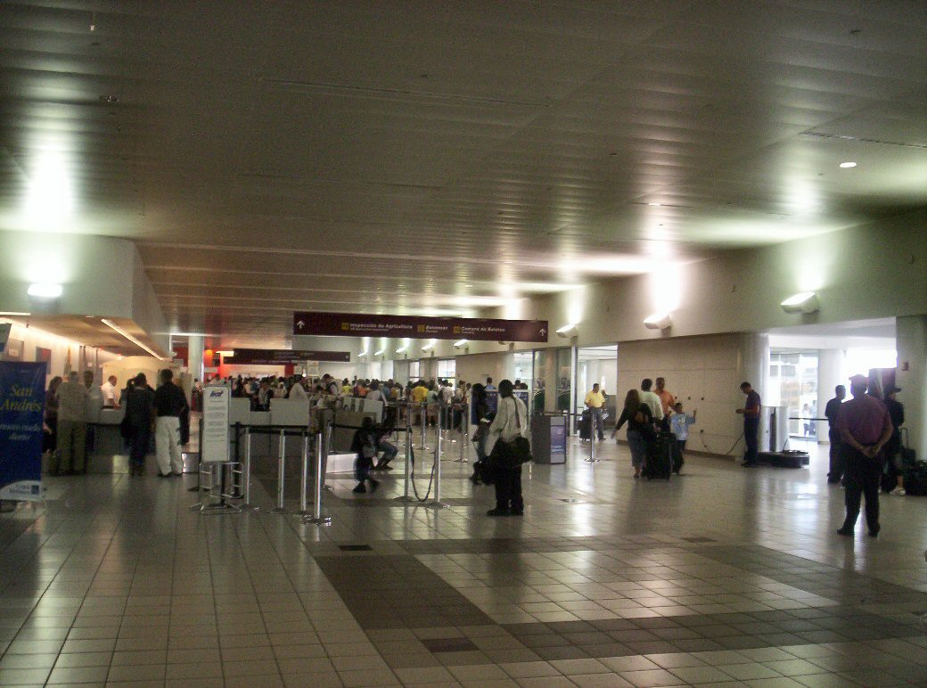
This is crucial for a user departing from or arriving at an airport. Effective and simple signage is vital for a pleasant and functional experience, as we show in this article using the work I had the experience of conducting at a major airport in Puerto Rico prior to joining and now doing it at Integra Architecture.
A new way for wayfinding
Unlike malls, parks and schools, airports are not places most people use very often, making it particularly important to get wayfinding right. Being able to locate your gate and be on time for a flight, perhaps in a city where you’ve never been before, is a must for the majority of travelers. Including wayfinding as an important quality of the user experience through interior and exterior architecture is therefore one of the main criteria in the institutional design of any such facility.
One reason is the frequent change of locations at an airport. For most of the time since aviation began, signage design and hardware systems were conceived as permanent installations. The signage was mainly unchanging due to the stability of the industry. Today, that’s no longer the case. Airlines come and go, forcing frequent changes in gate siting. New terminals are added, others expanded.
As a designer faced with enhancing the airport’s wayfinding system, the first step was playing the role of a typical passenger. The facility’s management had recently implemented significant renovations with which I was not familiar. Posing gates, security checkpoints, baggage claims and bathrooms as targets, I followed the signage to test its effectiveness and was able to pinpoint where I got lost and couldn’t get to my final destination.
After the initial test runs, I arrived at the ideal route diagram for the different passenger profiles that cross-referenced with the wayfinding floor plans I used in my walkthrough. That produced a work plan with points where changes needed to be made. Due to the constant remodeling, the biggest challenge was maintaining the signage consistent with the passenger’s destination.
The existing wayfinding infrastructure did not accommodate regular updates and was made with signs for the projected completed airport. Our solution provided for change-as-you-go wayfinding, enhancing the user experience in a way that helped the client manage the cost and hassle of frequent signage changes. Apply this to every other type of facility, and the result is a new kind of what we at Integra call Flexible Wayfinding.
Shopping, tourism, recreation, events — these are just some of the instances wayfinding is essential in enhancing livability and the user experience. Knowing where to go is decisive in a dangerous situation, particularly in public spaces. Wayfinding design, therefore, is not just an experience nice-to-have; it is also a resilience and security imperative.
Put those benefits together, and the result is a better way forward for all.

